Share


Notice a new dash of energy on Pioneer content? We’ve slowly added new colors, fresh fonts and a friendlier brand voice to pair with our focus on building stories together.
When we started thinking about updating our brand, we had two paths: Did it need a glow-up or a blow-up? While there are certainly times going all-in on a total rebrand—and we can help your utility do that if you need us—we were looking more at a refresh.
We wanted to see how it would work to introduce the brand refresh slowly. Here’s what we learned.
Nobody wants to throw out a closet of paper goods, a marketing booth and a ton of promotional swag. Not only is it a waste, but it’s also expensive.
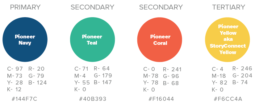
That’s why we wanted to keep some of our colors the same. Pioneer’s existing collateral still looks in line with our brand. The deep blue primary color and teal accent remain. Blues are known to signal trustworthiness in brand colors.
Identifying our brand archetype helped us realize that we needed some warmth in our colors. Our team is warm, friendly and caregiving, but our cool blues didn’t reflect that. We added two colors to our mix—a bright coral and StoryConnect yellow. Until now that yellow was limited to the podcast, e-newsletter and conference materials. The trickiest part was finding a warm color that didn’t clash with the existing yellow.
“It’s amazing what a larger palette can do for your brand,” Pioneer Director of Marketing Design Cherokee Spivey says. “The addition of a warm color, the coral, really brought our brand to life. We have so much more flexibility and variety in our marketing materials now.”
With four colors playing together, Pioneer’s able to integrate new pieces into our existing collateral. We’re injecting some fresh joy into a trusted, established look. The goal was for things that we’ve printed in advance, like business cards or our popular e-books, to not look obsolete while still having room for an energized look.
Fonts are a big part of your brand, too. One of the challenges we found with our old brand style was the use of Good Headline, a clean sans-serif font, with Northwell as an accent font. We loved the look and feel of the fonts together, but Northwell is cursive and may be hard to read for some folks.
We also know that brands—including Pioneer’s—never exist in a vacuum. As we’re seeing a wave of communicators reach retirement age, the new generation we are working with statistically doesn’t love cursive writing. Cursive was removed from the federal Common Core in 2010. So, doing the math, that marks the year that a current 30-year-old employee was a freshman in high school. While there are plenty of exceptions, we didn’t want our Northwell font to turn off the dynamic, smart 20-something communicators we enjoy working with.
We needed the glow-up to reflect how people grow up.
We moved to Real Head Pro as our main font. The change is slight, but our headlines are easier to read. We found a secondary font, Proxima Nova, to complement Real Head Pro. While it was fun to have two drastically different font styles, we found simple, paired fonts tell a stronger story. And since the main font is not a huge departure from the original, it pairs well with existing printed materials.
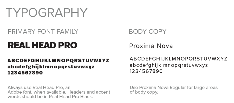
When considering a font, economics come into play as well. We didn’t want the glow-up to blow up our budget. Our team initially loved a font named Hartwell Heavy, which was not included in our existing Adobe font library. Since so many people at Pioneer would need it on their computers for slide decks, documents, social posts and more, we were looking at thousands of dollars in licenses. The Real Head Pro font is almost identical and saves us a chunk of our budget, as long as Adobe keeps the font and we keep Adobe. We also identified Segoe as an acceptable Microsoft version of the font that keeps within the spirit of the guidelines and is readily available.
When we changed our name to Pioneer in 2019, we added an Easter egg to our logo. To pioneer is to push forward, to break boundaries, to explore. If you look at our logo, you’ll see the curve of a moonrise cutting through half of the word. The full color version of the logo has the bottom in gray and the top in blue—a perfect match for the moon and those of us who aim for it.
With the glow-up, we wanted that curve to show up. You’ll see it in the background of many of our images.

We also extended the moon idea, adding an overlay of a moon in shadow as an option for our designers. Since this refresh is intended to last three to four years, that lines us up with NASA’s 2027 and 2028 moon missions which could allow for some nice alignment with pioneering cultural events.

Texture comes in handy sometimes, so we added transparent, repeated words in the backgrounds of some images. They are almost invisible, but if you look closely, you’ll see phrases about what Pioneer creates for our members: Scroll-stopping social. Podcasts that pop. Score with data.
You can see the texture on the cover of our 2027 content planner—yes, it’s ready! Get it at pioneer.coop/plan.
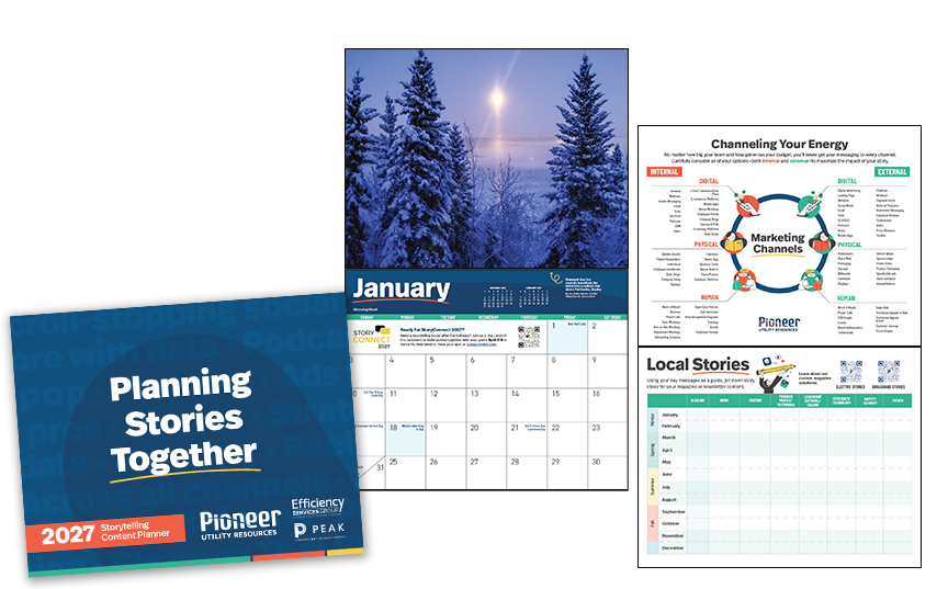
I may be overthinking it here, but I believe these words represent the way the Pioneer team works quietly in the background so our members can stand out. Like we always say, we serve so you can shine.
Going back to the point about external and environmental factors influencing a brand, you will also notice a lot of hands and faces in our new look. At a time when AI is creeping into so many aspects of our personal and professional lives, our goal is to subtly emphasize the human touch involved in our work by using images that highlight our shared humanity. Hands and faces do that better than anything.
To sew up the glow-up, we knew communicating it with staff was crucial.
Pioneer’s leadership team let everyone know the change was coming at an all-staff meeting in May, but we also let people know that we weren’t going to change everything at the same time. That’s important, because initially a few of us got bowed up that the glow-up would put a lot of extra work on our plates.
Instead, we used a Monday board to identify everything that would need to change, prioritized which items had to be done right away and what we could wait on, then added due dates in and assigned who would be working on which elements.
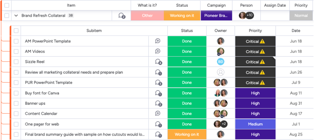
We established a timeline debuting the look at our annual meeting and made sure to write a handy explainer blog post right before the social media posts hit—you’re reading it now.
Across the team, folks have been eager to get started with the new look, so as a follow-up to the glow-up, we’ve offered Loom videos training staff on where to find new slide templates and shared a guide with all of the hex codes and font names.
“The overall impact is huge,” Cherokee says. “I feel like Pioneer has grown and changed so much over the last six years. Through the archetype and voice exercises we really explored who we are now and purposefully designed the brand refresh to better reflect that.”
A brand is more than fonts, colors and illustration styles. It’s the story you tell.
We began the brand refresh process many months ago by evaluating our existing brand—thanks to everyone who took part in our Pioneer Pulse survey—weighing how we felt and how we wanted you to feel about us.
A brand refresh not only impacts the marketing team. All of your staff reflect your brand, and you should include their voices when rebranding. We created a brand refresh team with people from all different areas of our co-op. If you’re working on a brand refresh, get folks involved from outside communications. Include people from operations & engineering, finance and member or subscriber services. Their insights on how your brand is perceived and how you can strengthen it are invaluable.
Did including that many folks slow up the glow-up? Yes. Did our glow-up cause a few blow-ups over a specific word or shape? Yes. Did our glow-up make me want to throw up my hands and give up a few times? Yes. But did these passionate opinions on the glow-up show up in the final product? Yes, and I think it’s much better for it.
Once we had a team, we identified our archetypes and came up with a clear, fresh focus for our brand. We met twice a month and then weekly to work through changes to the brand style and voice, creating a brand refresh guide for staff highlighting the changes. In the next few months, we’ll roll this into Pioneer’s larger brand style guide.
This post focuses on how we staggered the rollout to save costs and manage staff time. We’d love to work with you on the ideas and purpose behind your brand to see if there are ways we can help you shine, too!
We’re finalizing details on our brand voice, and we plan to share some lessons learned from that journey in a second blog post in the coming weeks. Have questions about our brand refresh process? Send them to hello@pioneer.coop!