Share

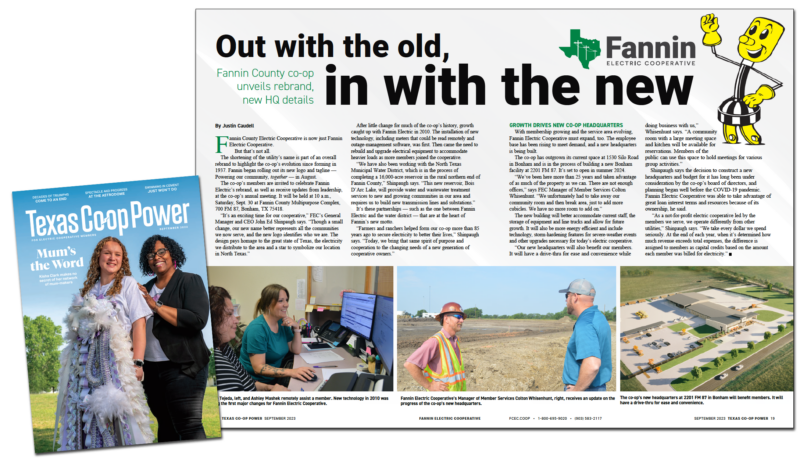
When a building boom turned a rural electric cooperative into one of the fastest-growing utilities in the nation, Fannin County Electric Cooperative needed a new look and storytelling tools to match its evolving story.
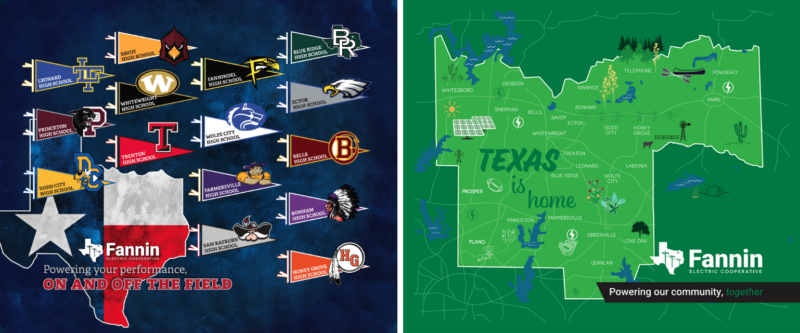
The Texas Utility Pioneers partnered with Pioneer to conduct focus groups and set a strategy for the rebrand. The utility eventually dropped the “County” from its original name to better reflect its overall service territory. A new logo and brand style upgraded their look to better reflect the co-op’s position as a key institution in a rapidly growing area.
Located in the northern Dallas suburb of Bonham, Texas, the utility serves a community with a small-town feel known for its charming downtown area. The surrounding area is booming, thanks in part to urban sprawl spilling out of Dallas and the creation of a nearly 17,000-acre reservoir.
The growth led FCEC to become the 19th fastest-growing electric cooperative in the United States — in an extremely cramped headquarters. Co-op leaders began planning a new facility for their 41 staff members. The COVID-19 pandemic delayed the process, but it didn’t delay the need.
“We’ve taken advantage of as much of the property as we can,” Fannin Manager of Member Services Colton Whisenhunt says. “We, unfortunately, had to take away our training room and then the break area just to add more cubicles. We have no more room to expand.”
Meanwhile, the co-op’s name needed attention, too. The utility operates more than 2,000 miles of line serving more than 12,000 meters across all or parts of five counties, Collin, Fannin, Grayson, Hunt and Lamar. Though the co-op is headquartered in Fannin County, each of the other four counties the cooperative serves have a bigger and more rapidly growing population.
That led to growing confusion among newer residents, especially those moving out of the Dallas metro area into the co-op’s service territory, about who provided their power. FCEC leadership knew they wanted to change the cooperative’s name. They just weren’t sure which of two paths to take.
Utility leaders had to tackle two issues at once. If the co-op was going to come to its membership with a plan to build a new headquarters, would this be a good time to also investigate a complete rebrand to modernize the look and feel of the cooperative and give it a stronger storytelling identity?
The co-op partnered with Pioneer Utility Resources to identify their needs and set a strategy, culminating with a three-phase rollout plan to share their evolving story.
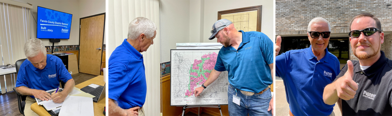
One of the management’s early requests was to hear what staff thought about FCEC’s story. Pioneer Account Manager Justin Caudell and Pioneer Marketing Consultant Jim Keiffer traveled to Texas to lead two internal focus groups:
“This was the first branding project we worked on which began with internal focus groups,” Justin says. “It worked out well, and it’s becoming a more common request.”
These focus groups helped lead to the recommendation to the co-op’s board to keep the “Fannin” name and drop the word “County.” The decision was made in part to keep the link to the cooperative’s history and to avoid any consternation among longtime area residents who aren’t exactly thrilled with the influx of people anticipated through the completion of Bois d’Arc Lake.
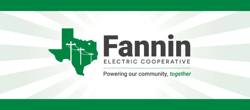
In addition to the shortened name, the Pioneer team developed a new logo for the utility.
The original logo featured Willie Wiredhand, a mascot introduced by the National Rural Electric Cooperative Association in 1950 to encourage people to think of electricity as a helpful “hired hand” on the farm and in the home. The logo also sometimes featured the tagline “Owned by those we serve,” which wasn’t unique to FCEC.

Pioneer Marketing Design Director Cherokee Spivey produced two versions of a new logo to help modernize the co-op’s brand identity. The new look focuses on Fannin and their role in powering Texan communities. The revamped logo features a unique tagline, “Powering our communities, together.”
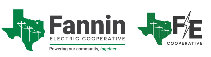 “Though a small change, our new name better represents all the communities we now serve, and the new logo identifies who we are,” Fannin General Manager and CEO John Ed Shinpaugh says. “The design pays homage to the great state of Texas, the electricity we distribute to the area and a star to symbolize our location in North Texas.”
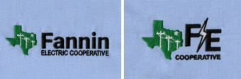
PRO TIP: When updating your logo, consider how the logo will be used digitally and physically. For example, Justin worked with Lands’ End to test both versions of Fannin’s new logo to see how the embroidery would look on branded clothing.
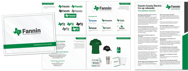
After the Fannin Board of Directors approved the rebrand in June, Pioneer helped Fannin create storytelling tools to help staff understand and communicate the change. This included:
Then the Pioneer team helped Fannin introduce the new story to utility members with a three-phase marketing campaign leading up to the brand transition in September.
“We used three strategic storytelling phases to generate excitement, successfully launch Fannin’s new name, logo and tagline and foster a strong sense of community involvement and pride,” Justin says.
Objective: Generate curiosity and anticipation among members for the upcoming rebranding of the electric cooperative and new headquarters.
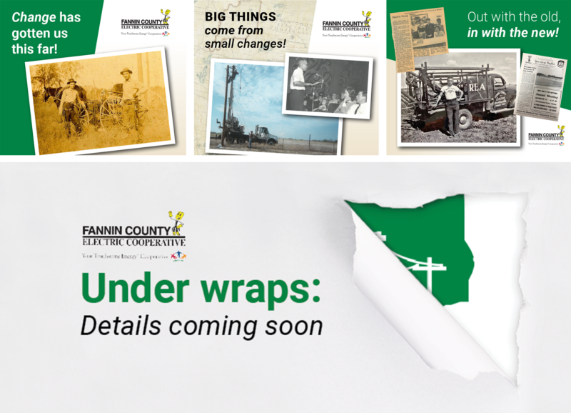
Objective: Introduce new name, logo and tagline, create awareness, generate buzz at the annual meeting in September. Storytelling tools included:
The team added new storytelling tools, including the website redesign.
“The idea for the new website came up at the Connect Conference in May,” Justin says. “The Powerful team started the process in July, and the website launched the day before the annual meeting. If you know how website redesigns are, that’s an incredibly fast turnaround.”

Objective: Encourage members and the community to embrace the new name, logo and tagline, fostering a sense of unity and pride with:
“Recognizing all the communities the co-op now serves was the focal point of Fannin Electric’s rebrand,” Justin says. “During Phase 3, we want members to embrace the new name, logo and tagline and foster a sense of unity and pride. These swag blankets really hit the mark!”
Change is hard. Moving on from a brand you’ve loved for more than 70 years can be tough, especially for longtime staff members. Find ways to honor your old name and logo as you transition to your updated brand.
After unveiling the rebrand at Fannin’s annual meeting, Justin gave a Willie Wiredhand bobblehead to the co-op. Fannin Bookkeeper Billie Whisenhunt accepted the gift.
“Billie has been an employee of the co-op for more than 40 years and misses Willie from the logo,” Justin says. “He may be retired from their branding, but this way Willie can still be part of the office.”
Fannin began 2024 with a new name, updated logo, staff branding guides and a redesigned website, but the mission remains the same: Powering our communities — no matter how big those communities may grow — together.
“It’s an exciting time for our cooperative,” John Ed says. “Farmers and ranchers helped form our co-op more than 85 years ago to secure electricity to better their lives. Today, we bring that same spirit of purpose and cooperation to the changing needs of a new generation of cooperative owners.”