Share

CLtel Marketing & Sales Manager Vernon Johnson shared his infographic ah-ha moment at StoryConnect 2025 during the Idea Exchange, one of the highest-rated sessions of event. Missed it? Here’s his story.
When I would share early drafts of articles or blogs internally, I would hear, “OMG, this is long. I mean I like it, but it’s too long. Can you make this shorter?”
I would defensively ask, “What would you delete?” I would usually get a shoulder shrug or an “I don’t know.”
I searched for ways to express our longer-form content into bite-sized samples. Not everyone enjoys reading text on a screen, especially when it’s anywhere from 500 to 1,500 words long. Even if you add subheads, highlight words, throw in a few graphics—and that’s when it hit me.
Let’s reimagine the information we’re writing and make it more visual, an infographic.
It can complement the story we’re already sharing and give those who are “TLDRers”—too long, didn’t read—a way to connect with CLtel on their terms.
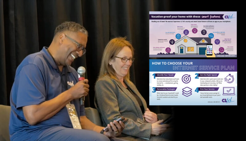
Here are a few examples of infographics that we’ve placed in our blog, social media posts, digital ads and even as leave behinds for our residential sales guide.


The results are squishy at best. Since they play a complementary role, we can’t confirm their inclusion led directly to a sale. But we know people are interacting with the content as we’ve received comments about the pieces from our residents. We’ve noticed shares on social media. And the digital ads have led people to the website.
Is this something I want to continue? Yes. The reason is that we want to provide as many opportunities as possible for individuals to connect with CLtel. That’s part of our strategy.
We’ve gone from a provider that focused on two social posts per week and the occasional email to a content publisher who is delivering a buffet of content to a starving audience.
Most of our infographics are used as hors d’oeuvres at the all-you-can-eat CLtel buffet. We simply write or record the content, pluck the important sound bites and work with Pioneer to serve up a delectable yet informative piece of content that’s a chef’s kiss.
Future infographics will incorporate less text and focus on a granular idea.
Examples:
This gives us many ways to tell multiple microstories throughout the year and offers the opportunity to encourage readers to access the longer-form content.
If you’re already creating videos or longer-form content, consider this visual storytelling element. Your TLDR audience will appreciate it, and it’s a great way to augment your content strategy. You’ve already created the content. All that’s left is pulling out the big chunks and reimagining it as an appetizer, entrée or dessert.

Vernon Johnson
Marketing & Sales Manager
CLtel, Iowa
Pioneer’s graphic designers help Vernon and other Utility Pioneers turn ideas and long-form content into easy to share and understand graphics. Want to add more visual storytelling to your channels? If you already work with us, ask your editor or account manager. Not a member of our co-op yet? Email hello@pioneer.coop to learn how we can bring your stories to life!